Introduction 🌟
HealthBeats is a health technology company offering a Remote Vitals Monitoring (RVM) platform for hospitals and clinics. The platform enables healthcare providers to remotely monitor patients’ vital signs, supporting proactive and continuous care from the comfort of the patients’ homes.
Background
The original payment system was developed quickly to support the platform’s launch. As the platform grew, it became evident that the flow caused friction and confusion, prompting a redesign to provide a smoother, more reliable and user-friendly payment experience for patients.
My Role 👩🏻💻
• Led the design of the end-to-end patient-facing mobile experience (iOS & Android), revamping the system into a secure and modernised payment solution.
• Delivered the redesigned Payment system in 2 months, providing patients with confidence and security when completing transactions.
Impact 🚀
Patients: Experienced a smooth and secure payment flow, allowing them to
complete transactions confidently and without friction.
complete transactions confidently and without friction.
Healthcare Providers: Reduced support requests and payment-related errors,
enabling care teams to focus on delivering quality patient care.
enabling care teams to focus on delivering quality patient care.
Exploring the Current Experience 🔍
We analysed the existing payment flow to identify usability issues, pain points and gaps in the user experience. In parallel, we studied both direct and indirect competitors to understand their product features and strategies. A heuristic evaluation further highlighted interface inconsistencies and discoverability challenges.
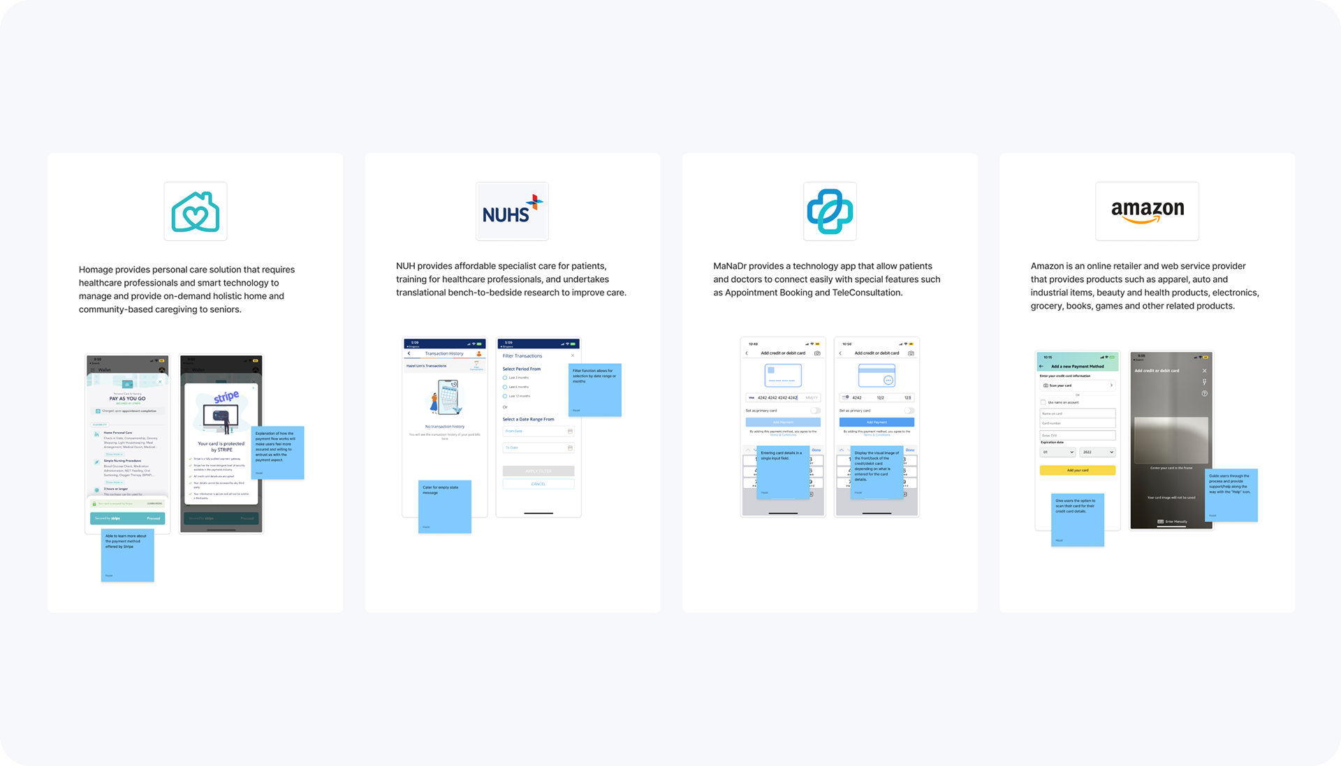
Examining payment flows and competitors to identify usability issues and interface gaps.
Challenges in the Experience ⚠️
Through analysis of the existing flow, competitor research and a heuristic evaluation, several key issues became clear:
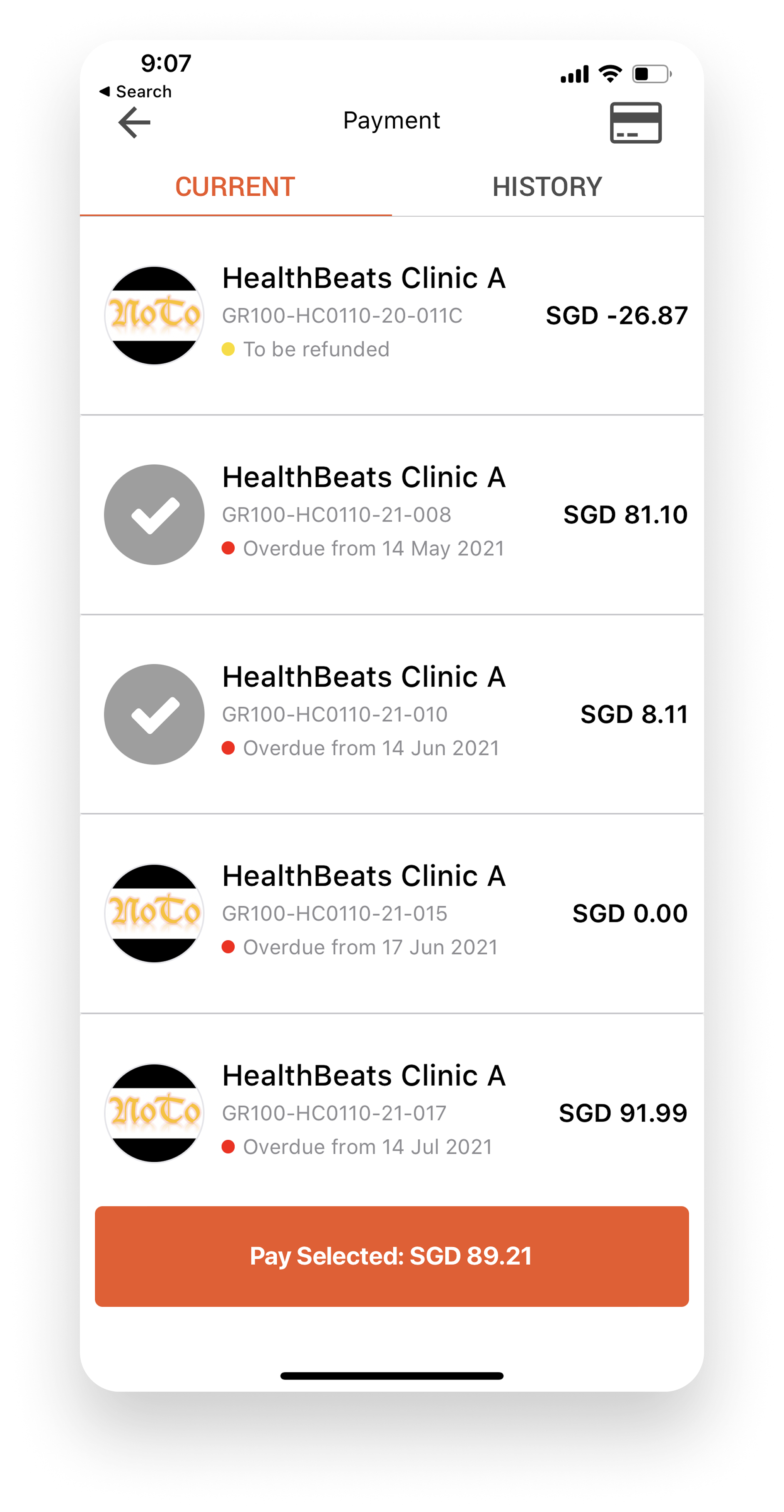
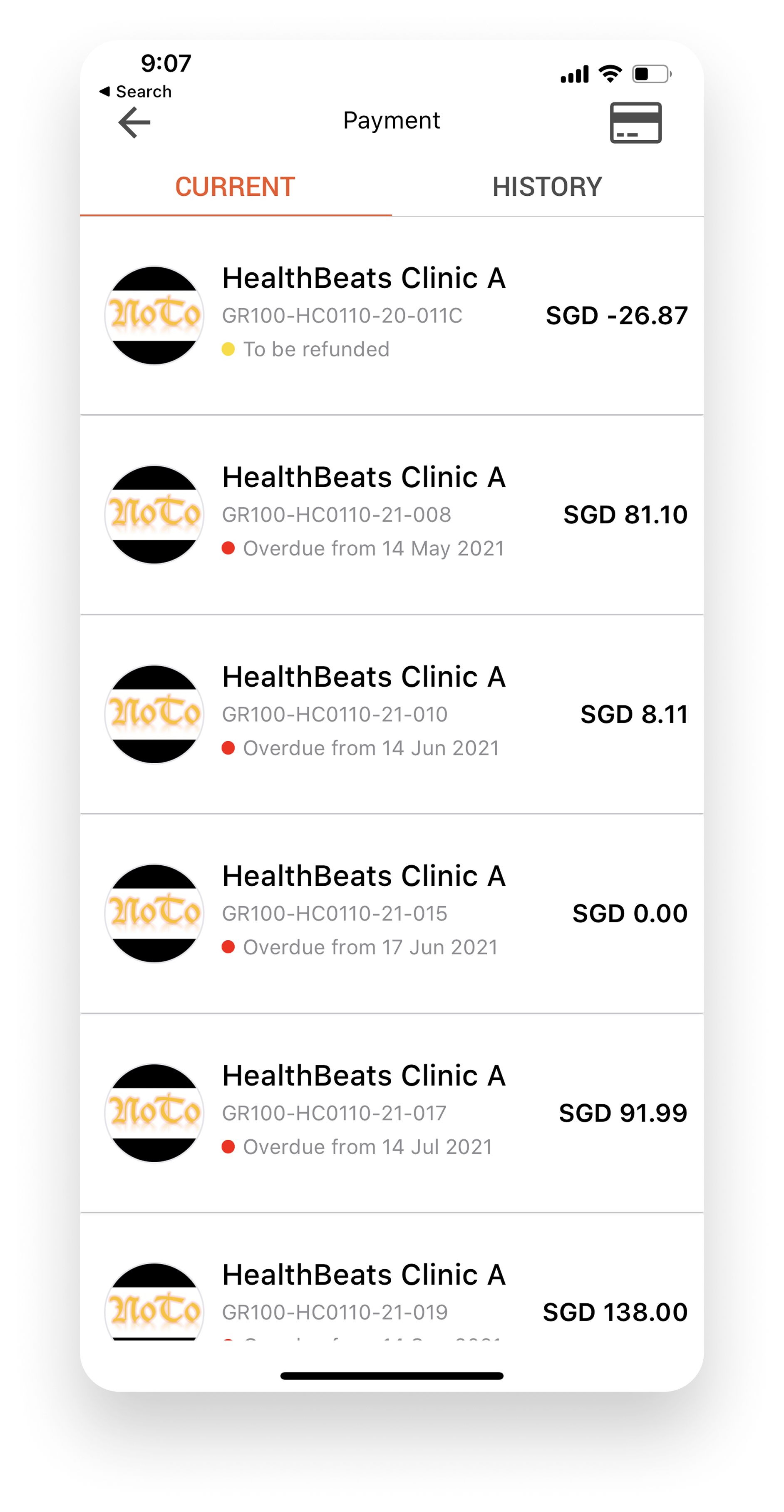
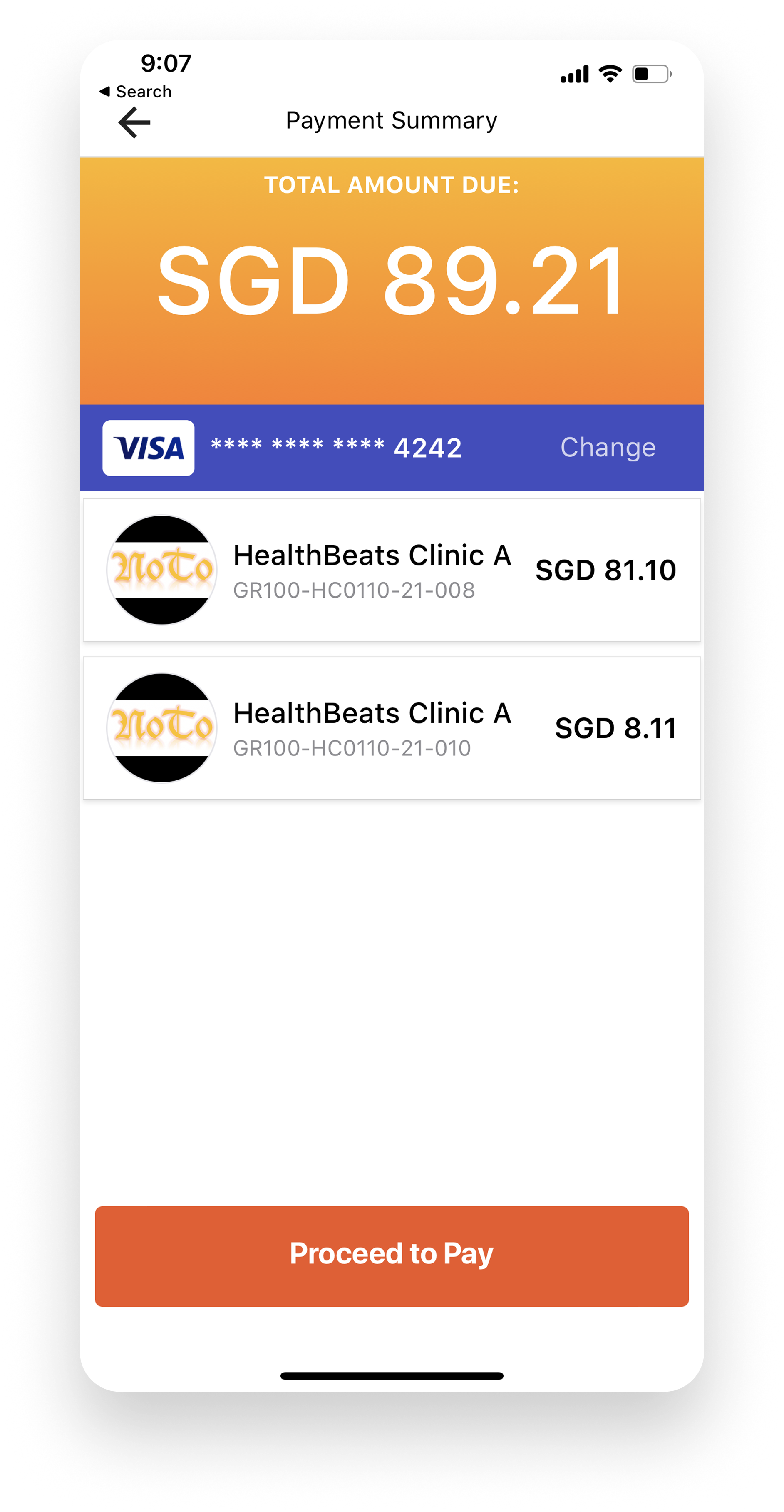
Problem #1 🚨
Confusing Invoice Selection
Users had to tap an invoice’s avatar to reveal
the payment button. Without clear guidance,
this interaction was unintuitive and often
overlooked.
the payment button. Without clear guidance,
this interaction was unintuitive and often
overlooked.
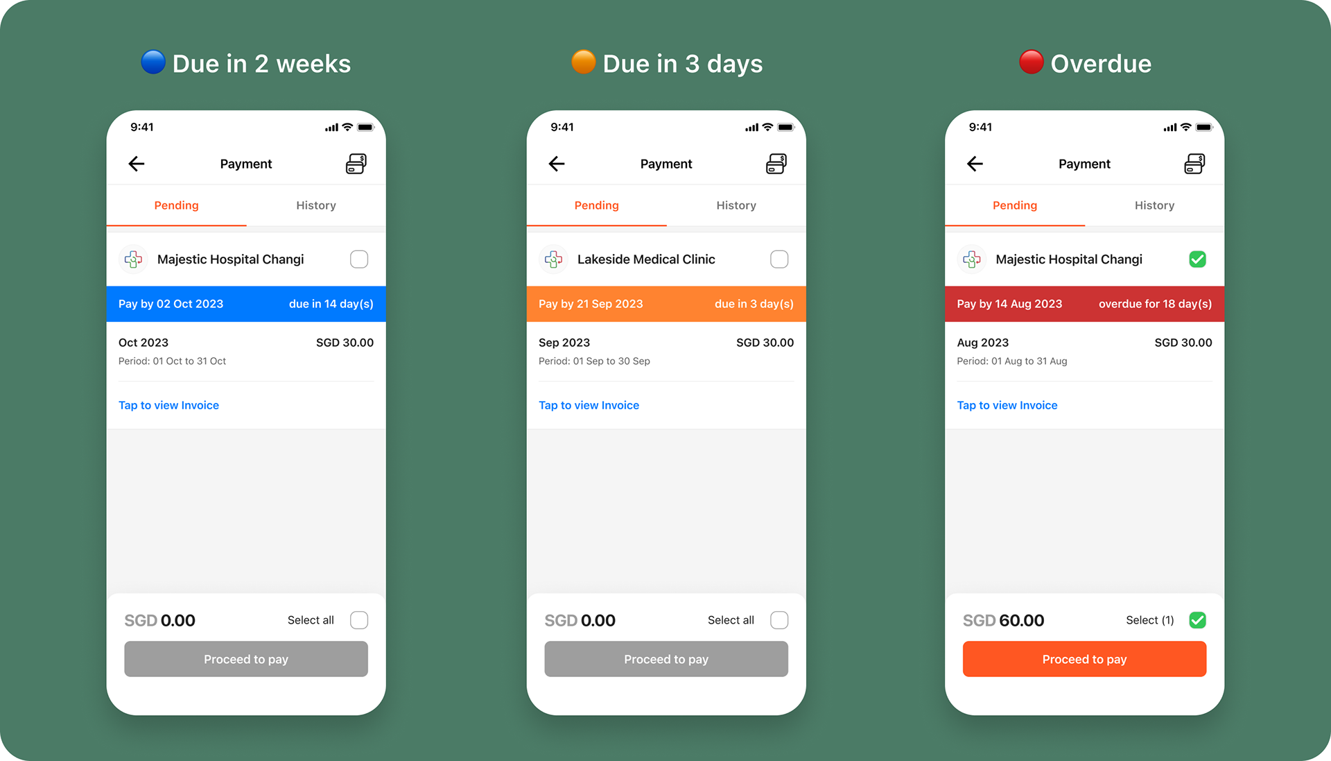
Problem #2 🚨
No Visibility on Upcoming Payments
There were no due dates, countdowns or
reminders for future invoices, making it difficult
for users to plan payments.
reminders for future invoices, making it difficult
for users to plan payments.
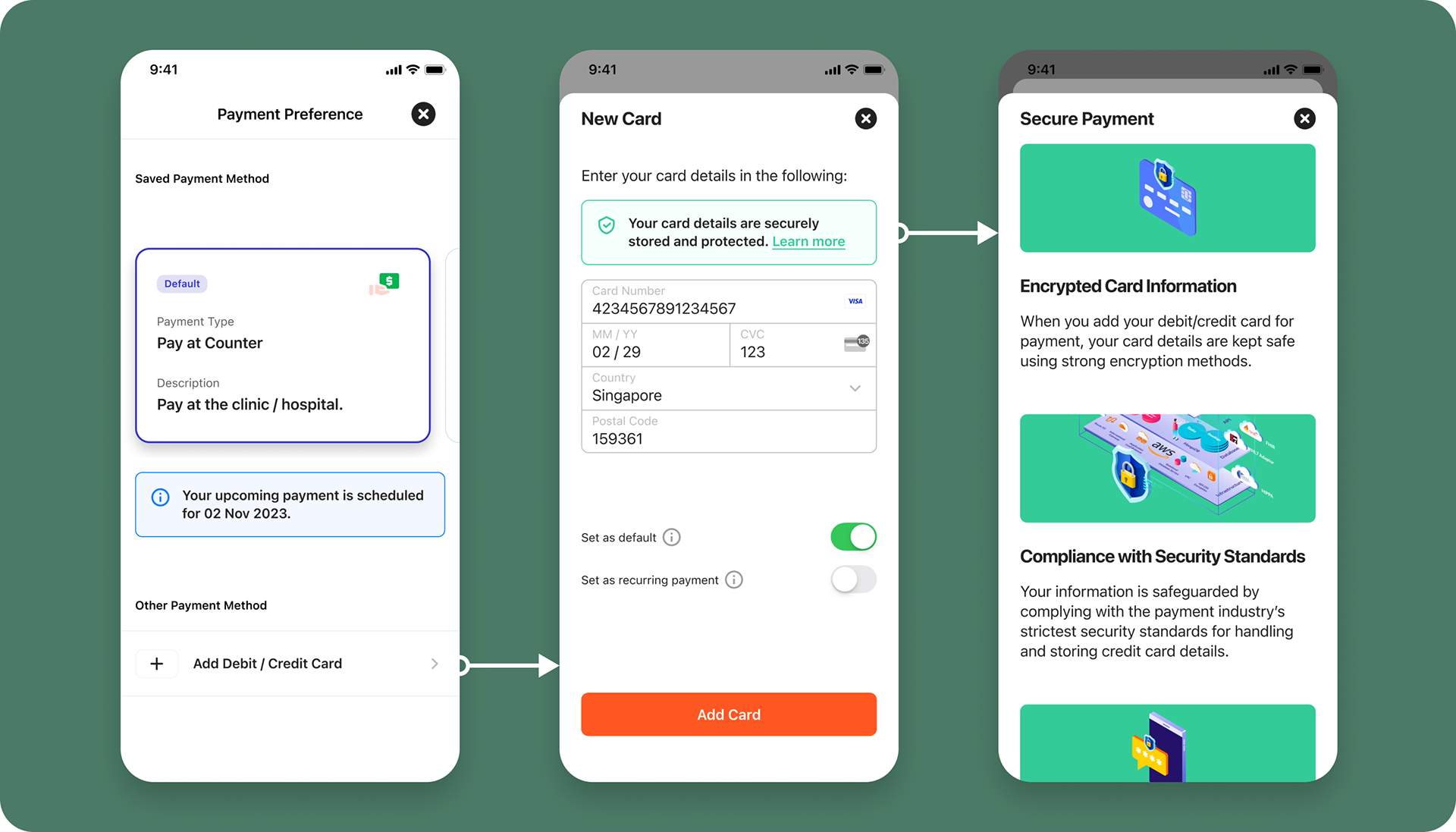
Problem #3 🚨
No Payment Security Assurance
The interface lacked visual cues or messaging
to reassure users about transaction safety,
which reduced confidence in completing
payments.
to reassure users about transaction safety,
which reduced confidence in completing
payments.
Framing the Right Questions 💡
From the problems we identified, we developed "How Might We" (HMW) questions to guide our design:


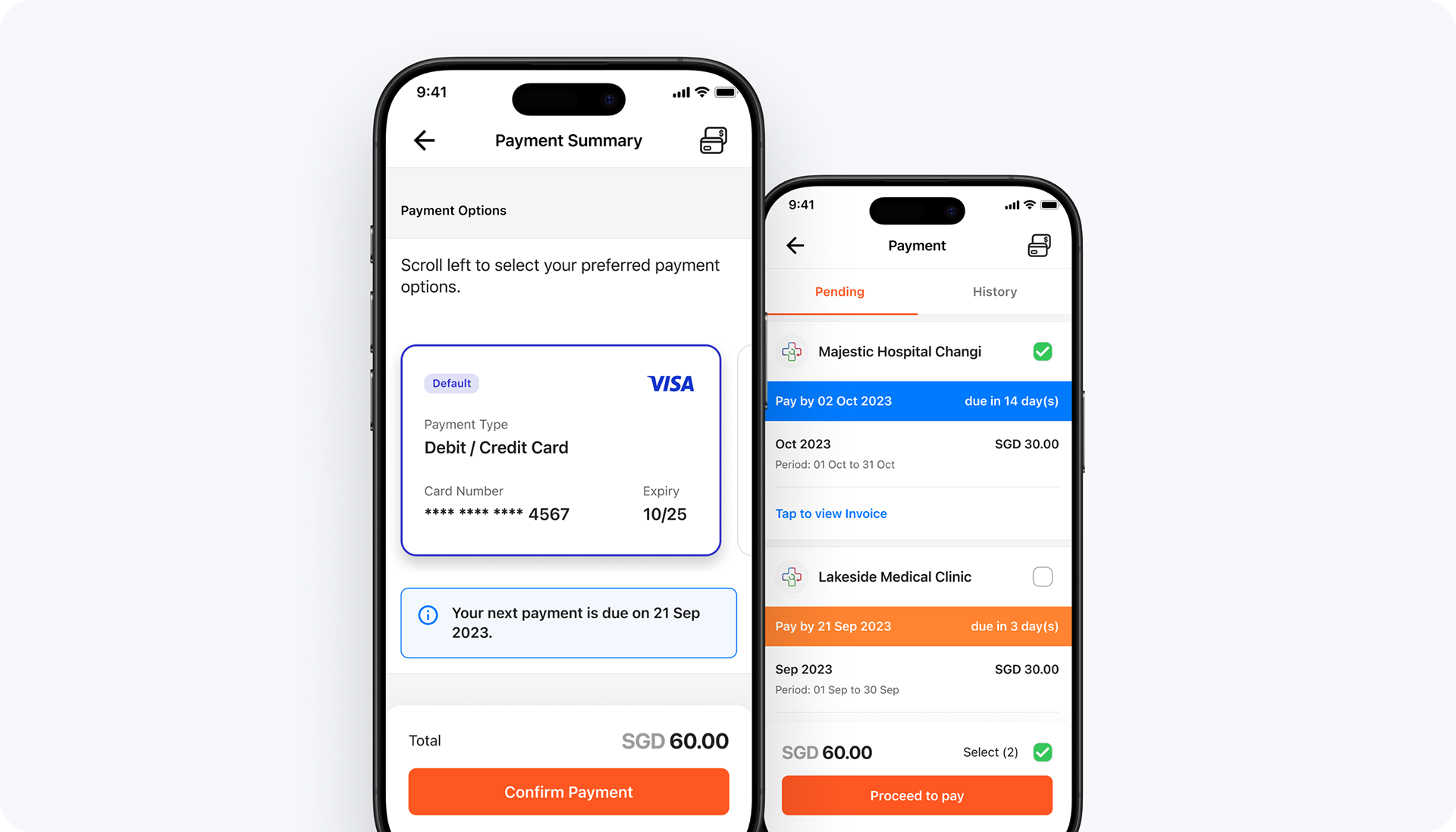
Payments Without Friction
Guided by our HMW questions, we redesigned the payment experience to be
intuitive, consistent and reliable across the mobile app.
intuitive, consistent and reliable across the mobile app.
Clear Invoice Status Indicators
Colour-coded badges and a clear visual hierarchy help users quickly identify payment statuses such as due, overdue or upcoming to reduce uncertainty and encourage timely action.
Flexible Payment Options
Dynamic in-page options allow users to select or switch payment methods without restarting the process, reducing friction and making the flow more adaptable.
Security & Trust Enhancements
Security icons, clear messaging about data protection and visual confirmation elements (e.g. payment success screen) reassure users that their transactions are safe.
Outcome 🎉
Stakeholder feedback and user testing reflected a more positive perception of the payment experience, particularly regarding ease of use and security, resulting in improved user satisfaction.
Clear invoice status indicators and flexible payment options helped users complete transactions on time, reducing payment delays.
Additionally, visual trust cues reassured users about the safety of online payments, boosting their confidence in the system.

Key Takeaways 📚
The original payment system prioritised speed over long-term usability, but redesigning it highlighted the importance of planning for scalability and establishing user trust from the start. Small but purposeful design changes boosted user and confidence and improved transaction completion rates, showing how thoughtful and targeted design tweaks can have a big impact.